B2BPay
Case study summary
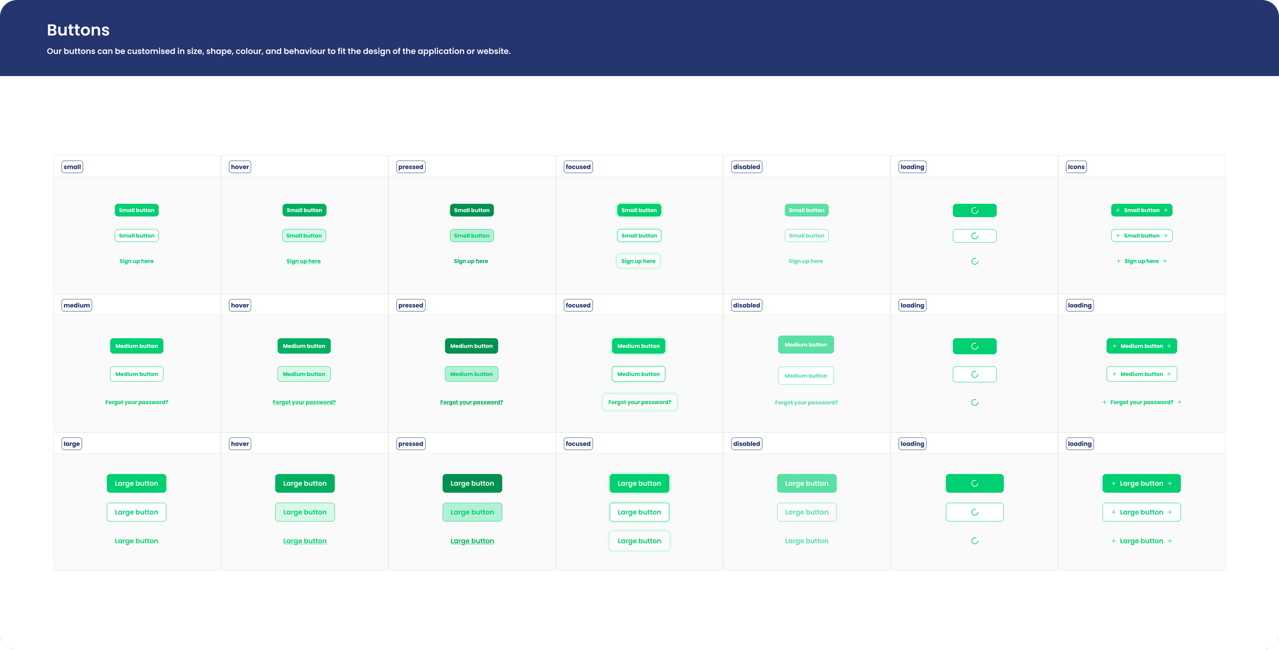
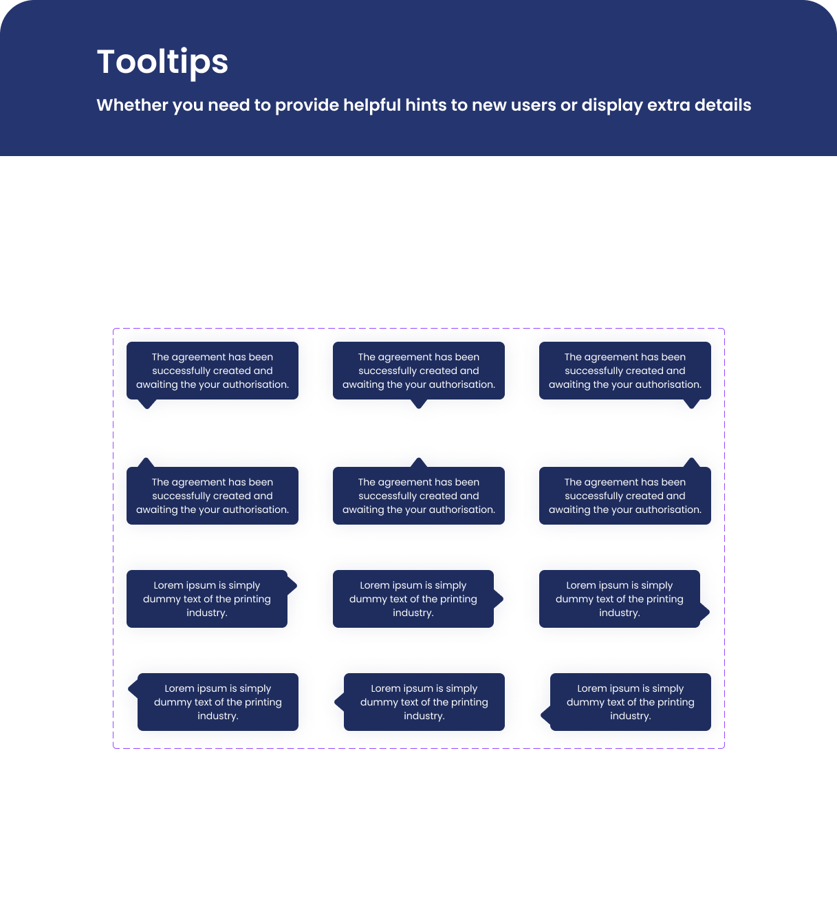
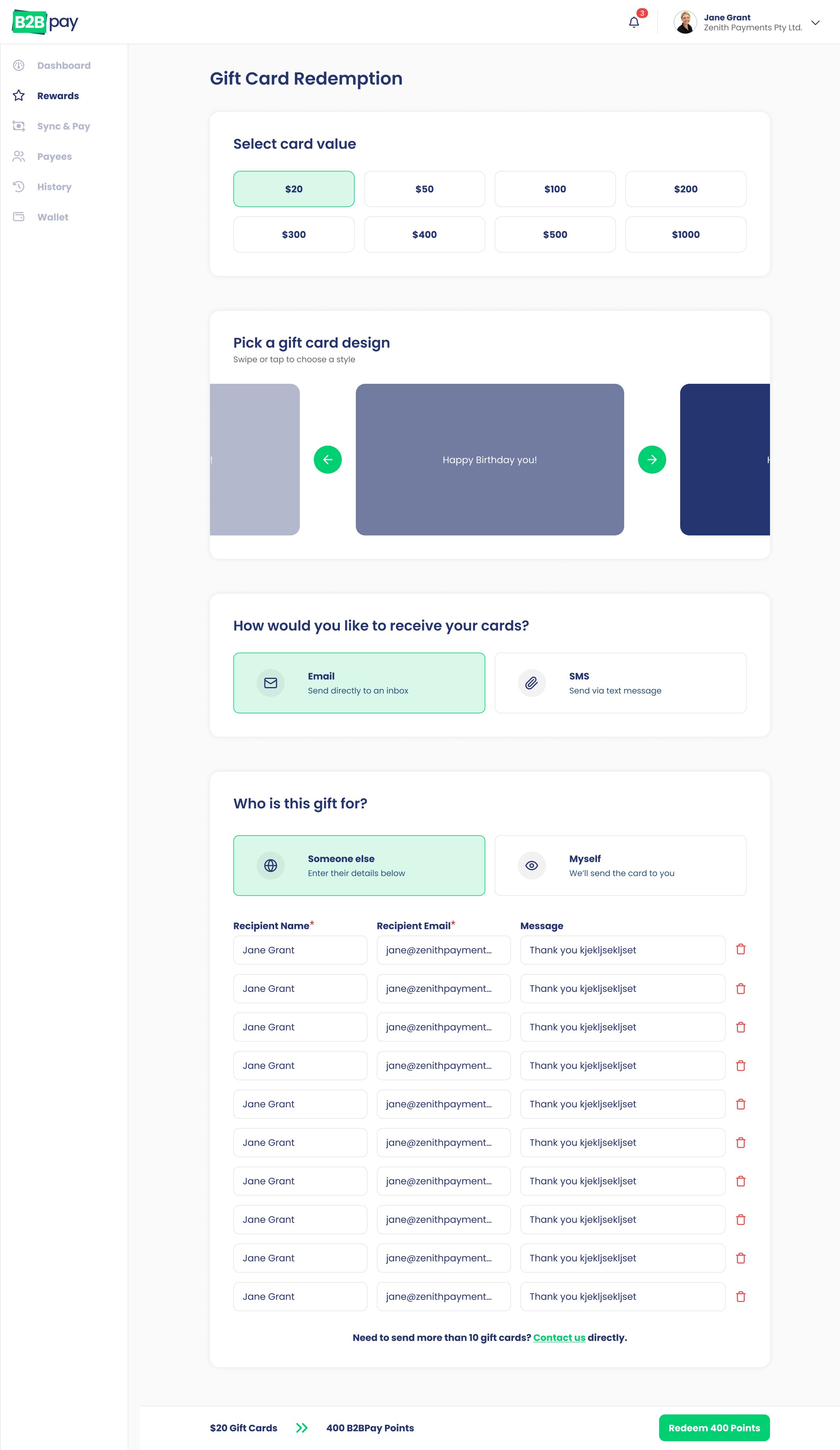
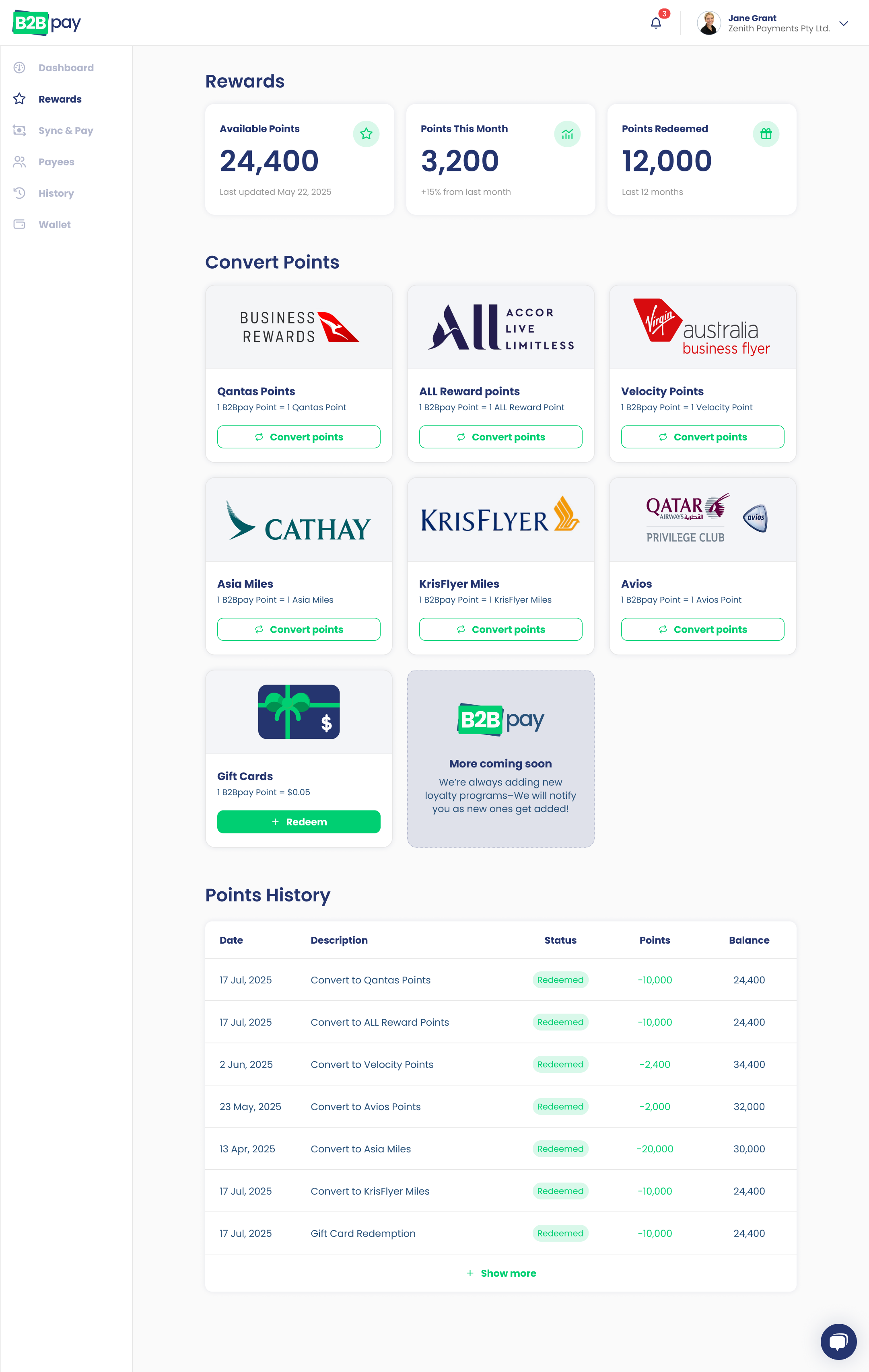
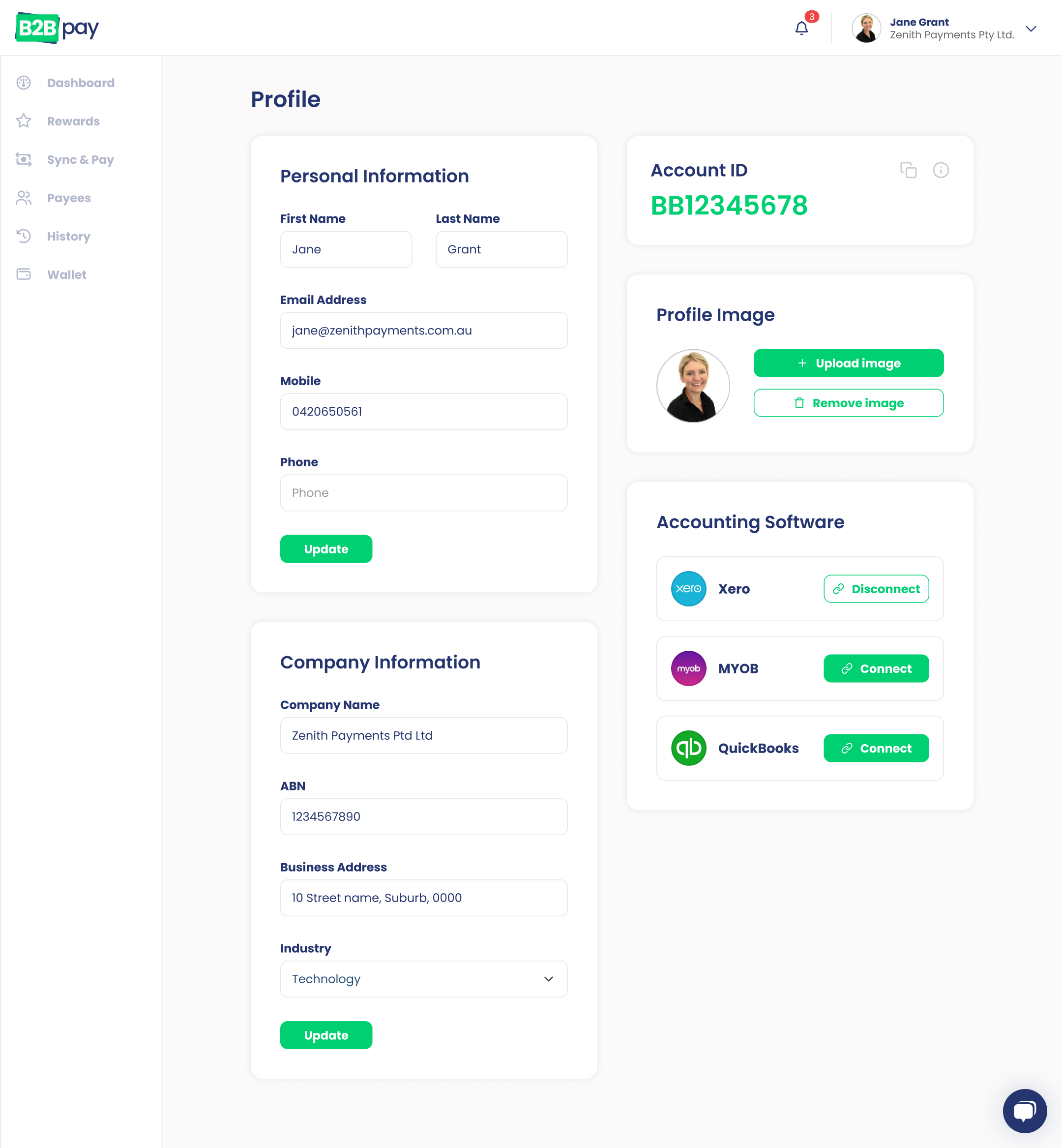
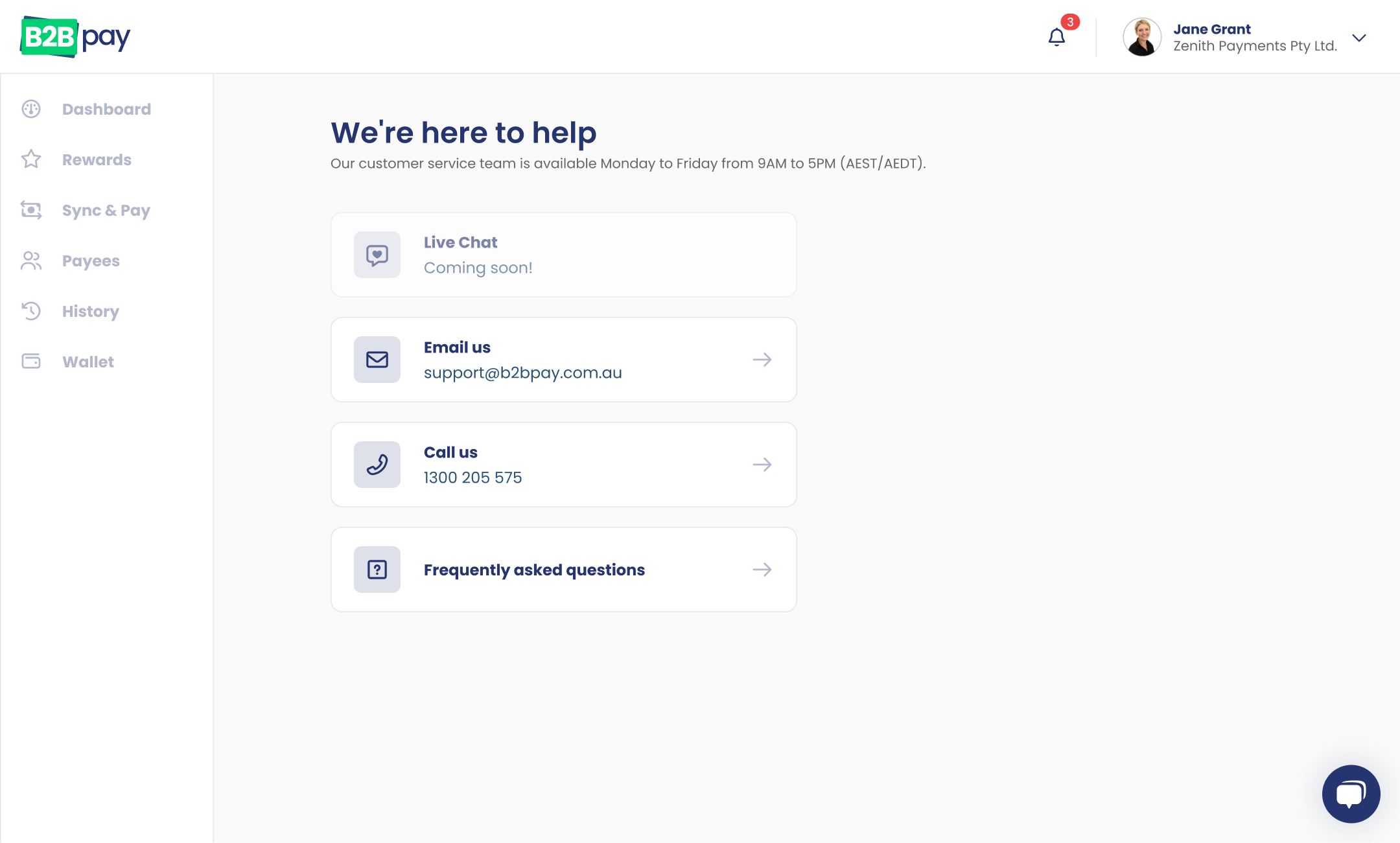
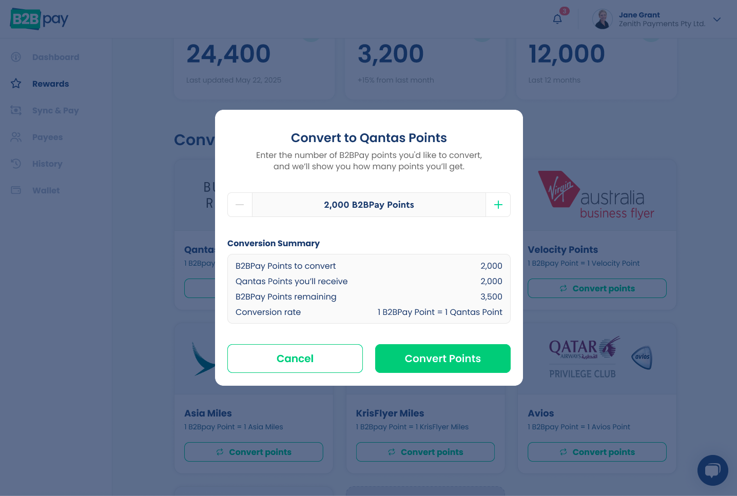
B2B Pay’s platform had become bloated and outdated as features and reward partners were added over time, making payments and navigation unnecessarily complex. I was brought in to modernise and streamline the experience, simplifying core payment flows and clearly surfacing the value of earning rewards, resulting in a more intuitive, confident experience for business users.
Problem
The existing product was built on aging technology and had accumulated years of features without a cohesive UX, leading to clunky payment flows, poor discoverability of rewards, and high cognitive load for users making critical financial actions.
My role
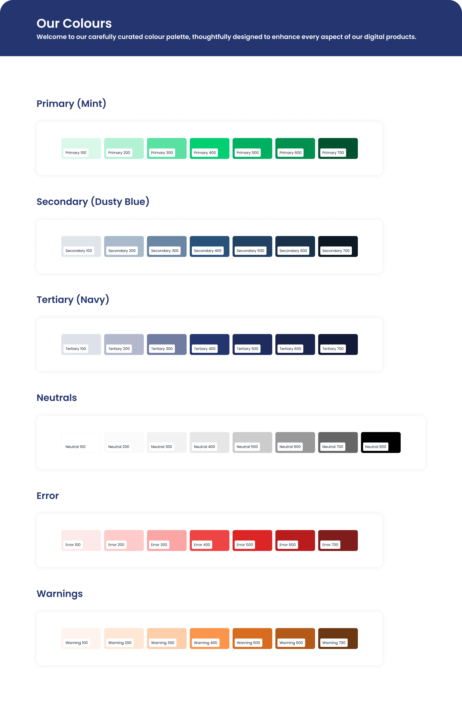
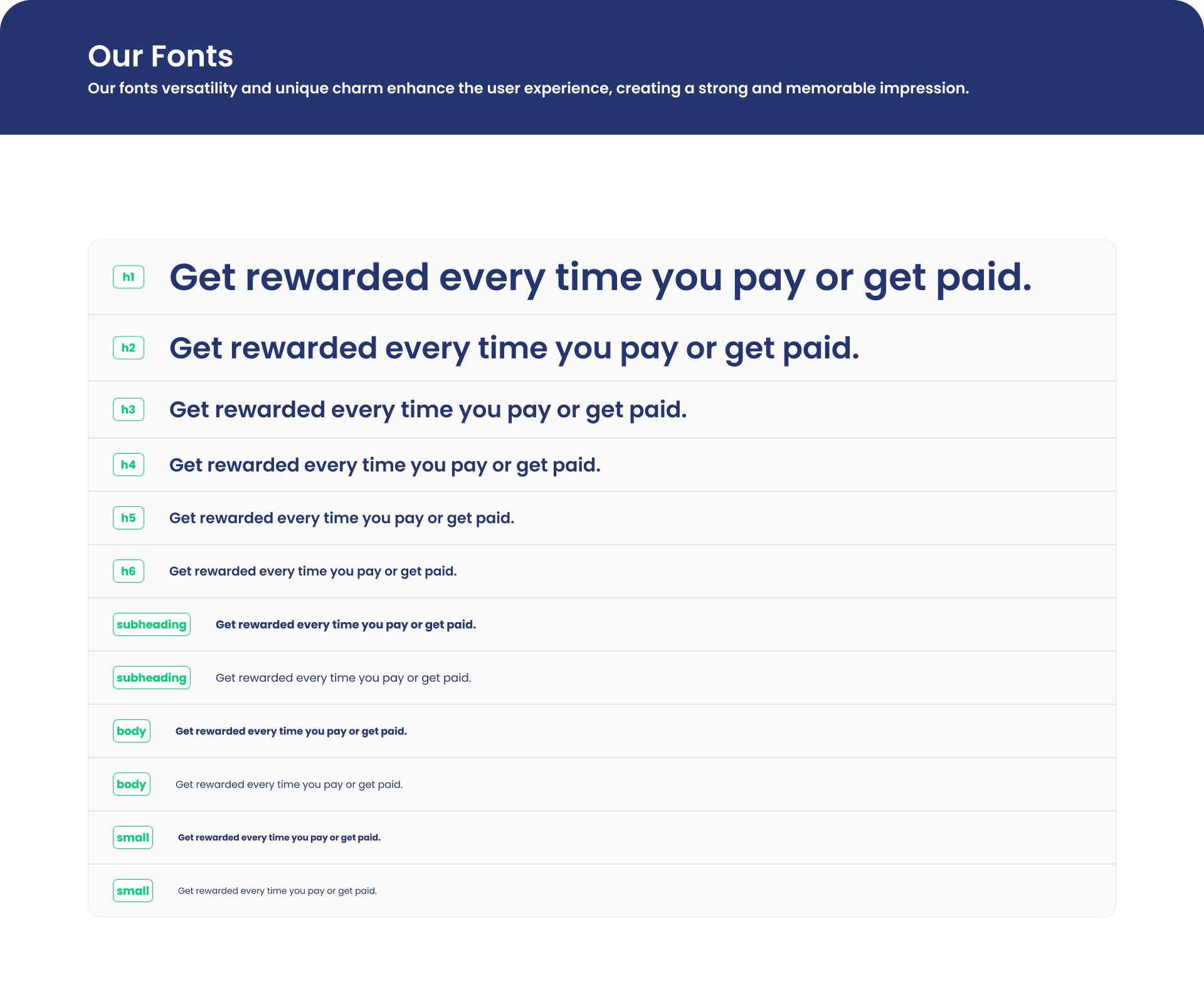
I was responsible for modernising the UI design system and redesigning key end-to-end flows, focusing on simplifying payments, improving navigation, and clearly communicating how users earn and redeem rewards as new partners were introduced.
Outcome
The result was a cleaner, more intuitive, and scalable experience that made business payments feel simpler and rewards easier to understand and engage with.